I always look forward to the new trend colour forecast from Pantone. I make a decision almost immediately which colours I will go for and they are usually chosen to go with items I already have stored away waiting to be unpacked when the weather starts to get better. This year Pantone SS18 have forecast some really unusual colours in the palette and I’m not keen on a lot of them!

magazines, bloggers, and any social media site are screaming about Ultra Violet!
I do like the UltraViolet that everyone seems to be so keen on. Will it suit me? No!
I am left wondering how many of you have already bought this colour? Have you? Are you going to? I like it, just not on me!
Which led me to thinking. What Pantone AW17 colours did I actually wear?
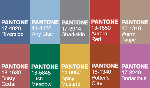
I remember very well that last year everyone was all over the Bodacious. Did you wear it?
I know I loved Warm Taupe, Sharkskin and Spicy Mustard. Airy Blue got a good airing! Pardon the pun! But that’s my all-time favourite colour! And it will come to play huge parts in my wardrobe colour even if it’s not in fashion.
I guess what I’m trying to get at..
So. I’m sitting here trying to remember what I did actually wear last summer and I know I wore Spicy Mustard by way of a lovely handbag that I have. You may remember it in my Daily Mail post. It’s an accessory I know but I did wear it!
I know I wore Grey. It might not be Sharkskin dark grey, does that count?
I wonder how many of us pick the Pantone colours off the rails and purchase without giving Pantone a thought? Or how many of us go out shopping with the Pantone colour chart in mind?
I wonder how much influence the Pantone colour forecast has over us and how it seeps into our wardrobe without us even realising. According to my memory, I failed miserably on the AW17!
Will I fail Miserably this year?
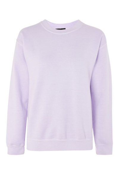
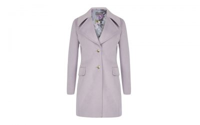
This year, the favourites in the Pantone SS18 for me are Almost Mauve, Cherry Tomato and Meadowlark. I am loving the Almost Mauve. I know that lighter colours will suit me best.
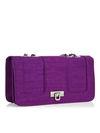
I’ve been eyeing up a few items of this colour before I knew it was a Pantone colour! and maybe I could add an accessory of Ultraviolet. Just a hint of the colour I might get away with.
And that’s the most important rule! If there wasn’t one colour there that I know doesn’t suit me, then yes I’m breaking the rules and I don’t care!
I won’t wear a colour that doesn’t look right just because it’s in fashion.
At a push, if I want to be on trend, then accessories are the way to go. Just a little here and there of an on-trend colour can make the statement of being in up to date fashion.
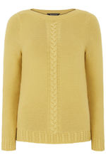
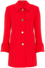
I’m going to leave you with some items that have caught my eye for Pantone SS18 – I will report back come winter to see if I broke the rules again!
Xo Laurie
Subscribe for the latest updates!
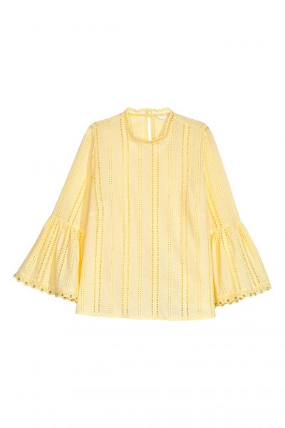

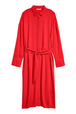

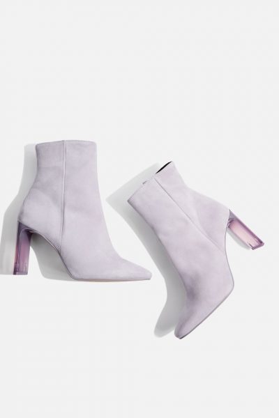

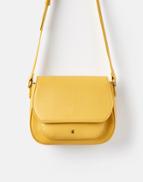
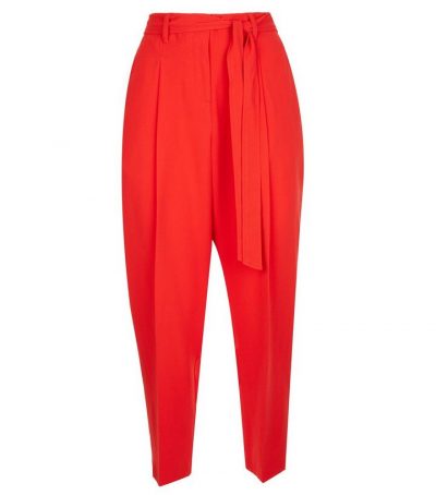
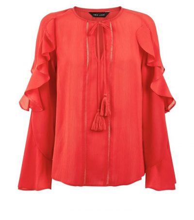
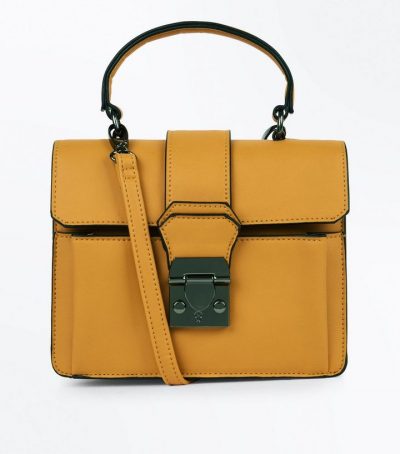
Pantone as a company actually makes an enormous work of explaining how color works, and how to mix them properly. Have you seen their Instagram profile? It it the example of a perfect design and great product placement! They got numerous positive reviews for doing it so complex and finished.
I love Ultra Violet although I have very little of that colour. I really like Meadowlark, Cherry Tomato and Arcadia too. That said, I just wear whatever takes my fancy, but it’s fun to see what colours Pantone choose each year. Thanks for linking up!
Emma xxx
http://www.style-splash.com
I do love ultraviolet. I used to never wear shades of purple, but do find them very pretty now. I am interested in seeing what is in the stores i shop. i loved mustard and potters clay last year. I think I d like to look at the chart to create some interesting color combos too.
Thanks for linking!
jess xx
have a good weekend!
http://www.elegantlydressedandstylish.com
I’ve never even heard of this ideology before but it is really interesting to read about the different colours X #anythinggoes
Chili oil, ultra-violet and lime are on my “look for” list. The other colors are not so me. Looking at the 2018 colors, you are right they are not so you.
I’m looking forward to seeing the new colours arrive in the shops, it’s always exciting to find the new styles and colours. Thanks for sharing these Laurie. Happy weekend my friend. Jacqui
http://www.mummabstylish.com
I use the Pantone colors as a way to challenge myself to think outside the box. I believe every woman can “wear” every color, even if it it just as an accessory. The colors Pantone puts out are not always good for everyone, but it is a good spring board to inspire new ways of thinking and new outfits. You always look fabulous, Laurie and just because you are a fashion blogger, doesn’t mean you have to wear the Pantone palettes. Pick what works for you. Have a great weekend. – Amy
http://stylingrannymama.com/
Amy, that is a good idea, …using one or more of the colors in an accessory. Good tip!
You go, my rebel friend. Great and informative post, I love that you are presenting alternative color ideas. I’m calling dibs on “Bodacious”. Xo Jonet
As a brunette I think that dark bold color suis me, but I would draw the line at wearing tomato red#fridayfeature@_karendennid
Fun idea for a post Laurie! I could not be any happier about ultraviolet for 2018. It is one of my favorite colors and I love mixing my midi skirt and knitted sweater with it. Looking forward to your end-of-2018 report though 😉 xo Sabina
I like ultra violet and I’m thrilled to see more lilac in the shops because it’s one of my favourites and is usually only available for bridesmaids dresses!
I think the only colour I would not wear is the tomato red. Love the lime punch and ultra violet and already wear these colours. Basically anything with a bit of punch but can do subtle 😉
Author
I look forward to seeing what you wear Mary xx
PS There are 4 colors that would look good on me in the new color chart. =)
Personally, I don’t go by fad colors. I know what looks compliments and good on me and then what makes my skin look ghastly, so that’s what I stick with or away from. The ‘trendy’ colors are just ways to try to get consumers to buy more, a marketing ploy.
Author
That’s exactly what I’m getting at Diana. Do we really need to follow these trends?
Agreed! (I also question how many of us wear everything in our closets and drawers. like our grandparents did. They had far less clothing but managed to dress well every day. Their closets were 3 to 5 feet wide, while we demand walk-in closets. In the US, anyway.)
I never liked the purples! But mixed together a little lavender…..mmmmm not in my face though! But a skirt, yes!
Author
The UltraViolet would look awful on me too Nancy. However, like you, I’m loving the Almost Mauve.
For the very first time, I was thrilled with Pantone’s pick this year. I love ultra violet and I look great in it! I’ve never been able to find much of this color in the stores. Now hopefully I will!
Author
It’s your luck year Amy! xx
Laurie, this is the first I have seen the entire color palette chosen by Pantone…until now I only knew about the Ultra Violet. I have to say, none of the colors appeal to me really at all…maybe the mauve. I don’t know what it is but they all seem a little harsh to my eye. Oh well, I need to shop my closet for a while anyhow so I will just stick with what I already have! Thanks for sharing…now I know what to expect to see in stores.
Shelbee
Author
I’m wondering how long I will have to wait to see one of these new colours on you Shelbee!
Thanks for this post, Laurie. It’s certainly getting me thinking about SS18 and WTW. I’m finding my heart drawn to a fresh yellow. I’ve gone through most of my adult life without yellow and in recent years it’s been calling me back. Maybe Meadowlark will win my heart this year … Hugs, x.